The importance of Alt Text for the visually impaired.
In the UK, more than 2 million people are living with sight loss.
This is not a slap on the wrist, it's an awareness piece for information and to spark a change that's needed.
“The idea for this Blog came to me while studying the capabilities of Artificial Intelligence (AI) and how it could be used as a force for good in the world.
AI image generators search the internet for likenesses to vague descriptors such as the ‘Google Logo’. This could be seen as similar to someone that was once able to see, or that has (or had) partial vision at some point. Thus, searching their memory banks to remember what that image may look like.
If there wasn’t a point of reference in somebody’s memory, they would have to rely completely on a description to form an understanding of the image. AI is similar in how it generates images based on a database of information, searching through it’s ‘memory banks’ to generate what the image may look like by being fed a description.”
“Wait a minute”, I thought. “Isn’t that how people with visual distress rely on using the internet through Alt Text? I could use AI to raise awareness and showcase how important Alt Text is, and maybe along the way draw attention to some names and brands that should be leading by example.”
– Chris Naylor, MD of Bnode Ltd. 31/07/2023

Let's start with some examples from the Bnode site.
For this project we have used Microsoft’s image creator that is powered by DALL-E. We found this to be quite accurate when giving good Alt Text examples and descriptions over a multitude of different tests. Below are a few examples to begin with using some of the Alt Text on the Bnode Website.
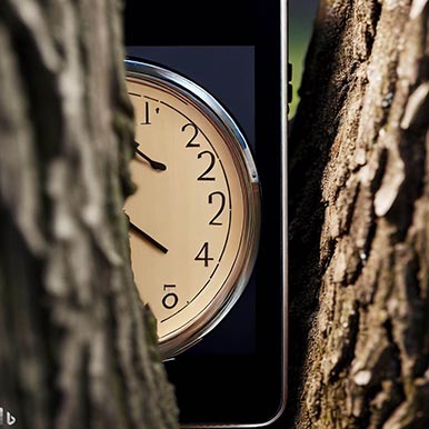
Bnode Ltd's home page
The image & Alt Text for the following can be found here: https://bnode.co.uk/
Alt Text Used: A clock wedged between two tree trunks, close up, shown on a tablet and mobile device.

Original Image
Ai Generated from Alt Text
Notes:
We were quite happy with this interpretation of our Alt text, however adding something like ‘side by side’ may have helped even further.
We will now move onto one more from the Bnode website where a longer Alt Text description had been used, however even then, there were things to consider.
This is not about being perfect, it’s about being fit for purpose.

Bnode Ltd's Blog page
The image & Alt Text for the following can be found here: https://bnode.co.uk/what-is-the-social-model-of-disability/
Alt Text Used: A person that looks to identify as female, facing the camera and is flexing their arms. They are wearing a blue shirt and have a serious face expression. Next to them is another image of them, but this time they are smiling and holding their arms up like a ‘champion’ pose. The background is white.
Original Image
Ai Generated from Alt Text
Notes:
We noticed here that our Alt Text had missed out that the image on the right hand side was actually wearing something different (a red and white striped top) compared to the image on the left.
Although overall we were happy with this outcome still, even though the AI hadn’t changed the pose of the image on the right as we had described, we felt that the overall interpretation of the context behind the image was still present.


And now onto the bit you’ve all be waiting for. First up, Supermarkets.
ASDA
The image & Alt Text can be found here: https://www.asda.com/discover-summer
Alt Text Used: Beach
Original Image
Ai Generated from Alt Text
Notes:
Well it’s quite obvious isn’t it? Just using 1 word for Alt Text doesn’t really explain what’s going on. Unfortunately this poor man has been completely deleted from the image.
Surely it can only get better from here can’t it?
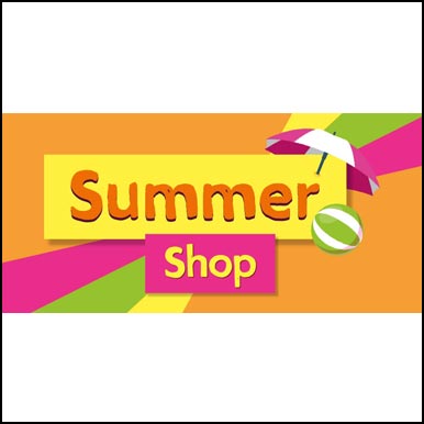
Let’s give Morrisons a go next shall we…


Morrisons
The image & Alt Text can be found here: https://groceries.morrisons.com/browse/summer-shop-188448
Alt Text Used: Summer 2023
Original Image
Ai Generated from Alt Text
Notes:
With double the amount of words as ASDA at a staggering 2, Morrisons are still lacking in their understanding of Alt Text. It’s a shame that someone in their design department came up with their ‘Summer Shop’ banner which has been completely lost on someone that is visually impaired and using a screen reader for their online experience.
Also Sainsburys have used ‘Summer offers’ on one of their banners here, which resulted in something similar from the AI, making a smiling lady holding some yellow flowers.

So not a great start really, how about we try some well-known Fast Food companies?
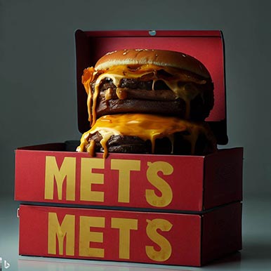
Burger King
The image & Alt Text can be found here: https://www.burgerking.co.uk/
Alt Text Used: Double Melts King Box
Original Image
Ai Generated from Alt Text
Notes:
We’re getting ever so slowly better with 4 whole words now, however without a point of reference to what is being explained, all that the AI can do is try to picture what it could look like. Maybe perhaps similar to someone if they were blind from birth.
To be honest though, I’d definitely go for one of those AI ‘Double METS burgers’, they look delicious.
It’s a shame that AI’s not managed to get letters right yet too.

KFC
The image & Alt Text can be found here: https://www.kfc.co.uk/
Alt Text Used: KFC logo
Original Image
Ai Generated from Alt Text
Notes:
Oh KFC, not everyone has ‘seen’ your logo to recognise it. Putting ‘my company logo’ just doesn’t work for people that have been visually impaired from birth, or perhaps have some limited vision but not enough to see and recognise your branding online. Always describe what the image is as if describing it to someone that has never fully seen it before.
How much did your branding and logo cost you? Describe it with pride.
Let’s see how good the mighty McDonalds are.

McDONALDS
The image & Alt Text can be found here: https://www.mcdonalds.com/gb/en-gb.html
Alt Text Used: reward
Original Image
Ai Generated from Alt Text
Notes:
“At McDonald’s we’ve got [reward] for you!” And that’s about enough for my singing just now.
Once again, a single word does nothing, says nothing, and all the work that has gone into the promotion and images has just been lost on anyone using a screen reader.
What messages do these fast food companies give? That visually impaired people don’t matter? That they don’t want their business and their ‘rewards’ aren’t for them?


Although some of these may have been amusing, on a serious note, something has to change. Let’s look at a few companies that are on the right tracks.
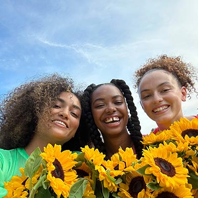
Apple
The image & Alt Text can be found here: https://www.apple.com/uk/iphone-14/
Alt Text Used: A sharp and vibrant selfie of three people holding yellow flowers, taken with the TrueDepth camera.
Original Image
Ai Generated from Alt Text
Notes:
Apple seem to use Alt Text well throughout their website. This example, although just 1 sentence, is short, to the point, and gets over the general concept of the image well. Adding elements like how the people look to identify would be the only way to get more accurate, and perhaps doing that rather than mentioning the camera that was used to take the image would be a better use of the descriptive length.

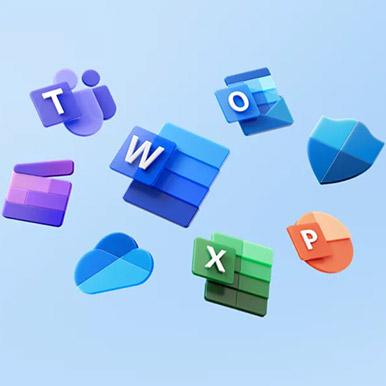
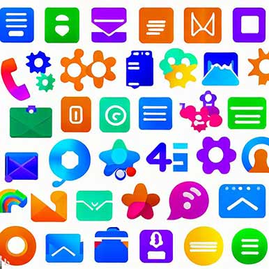
Microsoft
The image & Alt Text can be found here: https://www.microsoft.com/en-gb/
Alt Text Used: Icons from the Microsoft 365 suite of apps such as Teams, Word, Outlook and more.
Original Image
Ai Generated from Alt Text
Notes:
Microsoft have also followed the 1 sentence path, however like KFC, they have relied on people knowing what their icons look like to begin with. Also from the AI generated image, we can see that not stating the number of icons and positions of them has led to a little confusion.
All in all though, the general concept has been given across for someone using a screen reader and relying on the Alt Text of image descriptions.
Who would you like to see us review next?
We hope you’ve enjoyed our short look into online accessibility for these few companies. Join in the conversation via Linkedin and tell us who you would like us to review next time.
And this is just skimming the surface.
We feel that it’s fair to conclude from this very small study that many companies are not providing an inclusive experience when it comes to their online presence.
It’s also worth noting that this conclusion is from only looking into their Diversity and Inclusion online for visually impaired individuals, never mind providing an accessible website for many other additional needs out there.
If anyone reading this has any contacts within the companies mentioned, we would love to help them become more inclusive online. Please get in touch with us via the form below and let’s ‘make the change for good.’
Also, if your own website could do with an accessibility audit or you would like some assistance on implementing more accessible elements such as these, please get in touch below.